Debategraph in the Classroom
When Peter and I first set out to create Debategraph, one of our fondest hopes was that the tool might help to enrich the collaborative and visual learning experience for students in schools and universities.
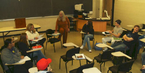
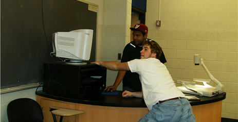
So it has been a joy for us this semester to be experimenting with Debategraph in classroom with Dr Sharon Chanley and her politics students at Western Illinois University—and we are tremendously grateful to Sharon and the students for having the curiosity and courage to innovate in this way.

Dr Sharon Chanley and the students of POLS 275
Sharon’s class is exploring issues of poverty and wealth inequality in the U.S. and the historical and existing public policy responses to these, and Sharon explained to us what initially captured her imagination about Debategraph:
When I first came upon the DebateGraph in my search for policy-mapping examples, I felt as if someone had designed it specifically for my approach to teaching — almost as if they had observed my discussion-based classes and then depicted them graphically. In teaching policy issues and the political processes involved, I want students to understand their complexity and the interrelatedness of the issues. DebateGraph allows me to do that in a way that two-dimensional images and discussion alone can’t. Students develop their ability to research their positions, find answers to the compelling questions, and enhance their critical thinking skills while providing me a way to comment on and complete individual assessment of their work — all important to their learning in and beyond the classroom. And, they can do it in a format that fits into their familiarity with the computer, the Internet, and their preference for the visual and importantly in a way that connects them with the rest of the world.”
During the first phase of the course Sharon and the WIU students—Brandon, Colisha, Derek, James, Jan, Jared, John, Julio, Kimberly, Patrick, Robert, and Ruth—are using Debategraph to build an informal collaborative overview of the policy domain. You can see their work in progress below—and in the next phase of the course the emphasis will shift more to deepening the map and developing a more formal structure for the material.
We have been delighted with the enthusiastic feedback from the students so far, who have taken to this new approach to learning in fine style:
I like the DebateGraph as a learning tool because it teaches us how to do in-depth research. It also allows us to open up class discussions, which allows us to hear other people’s points of view.
The DebateGraph is an excellent learning tool which helps students learn through critical thinking. I really enjoy the exercise.

I think the DebateGraph is an outstanding learning tool. It forces the student to look in-depth at a particular subject. It makes people come up with questions to see if the particular problem can be resolved.
In general, I like the graphics display as a study tool. The generation tends to like information that is bite-sized, easily accessible, and fast paced, so the point and click nature makes it very easy to find information and explore related topics which may have been otherwise overlooked.
DebateGraph is not only a great tool, but it has allowed me to gain new knowledge. It is also a great tool for students to learn about policy issues, and it is also a great tool to use.
The DebateGraph is a really cool way to debate topics so that there is a structure and much more information can be transferred.
The students’ feedback is all more gratifying given that 40% of their overall course grade is being assessed on their individual and collaborative contributions to the map. And Sharon has been employing the RSS feed, email alerts, and edit history to support her grading process—and the map Message Board to ask, and answer, student questions outside class hours.
From our perspective it has been a wonderful start, and an experience from which Peter and I are learning much too about the ways in which Debategraph can be used in the classroom; a learning experience for which we would like to give Sharon and her pioneering students a wholehearted Anglo-Australian vote of thanks.
Visualizing Middle East Peace
The events in Israel and Gaza this year have prompted gloomy prognoses for the prospects for peace; a mood deepened by the mixed signals from the Israeli election and the latest developments with Iran.
Lord Patten, writing for European Voice last month, struck a particularly bleak note:
"However tough things looked in the past, I have never felt such a sense of despair about Palestine and Israel. Reason has been drowned in blood. It seems as though the politics of hope have given way to the politics of the cemetery. Poor Palestine. Poor Israel."
Independent readers and the Debategraph community have started to explore the options for peace in the Middle East over the last few weeks, and, though the map is still at an early stage of development, it already provides a succinct insight into the nature and scale of the challenge; showing how strong views at either end of the spectrum pull the peace proposals towards the gyre of despair.
One of the advantages of visual mapping in this context, though, at least at the outset, is that it’s not asking anyone to take sides: just asking everyone to pool their understanding to map the contours of the problem.
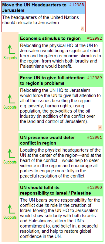
The visual mapping process also opens up the possibility of creative brainstorming and lateral suggestions, such as the proposal to relocate the UN headquarters to Jerusalem, illustrated below – and we would like to see more contributions of this kind as the map develops over the coming weeks.

Given the progress made with the map so far, and the work still ahead, we’re extending the first mapping phase through the spring, and, will be including other partners in the process as we seek to engage the main actors in the region.
Anyone who would like to join us in this process is welcome to do so, and, if you would like to involve your own blog or website readers in the debate, you can embed the map—like a YouTube video—using the embed code shown below:
<iframe src=’http://debategraph.org/flash/fv_indep.aspx?r=11474&d=2&i=1′ frameborder=’0′ width=’490′ height=’650′ scrolling=’no’></iframe>
In the meantime, I will be examining different areas of the map in detail on the blog over the coming weeks and will present the mapping community’s work-in-progress to a conflict resolution forum in Haifa later this year.
Cross Posted at: Independent Minds

