Visualizing Middle East Peace
The events in Israel and Gaza this year have prompted gloomy prognoses for the prospects for peace; a mood deepened by the mixed signals from the Israeli election and the latest developments with Iran.
Lord Patten, writing for European Voice last month, struck a particularly bleak note:
"However tough things looked in the past, I have never felt such a sense of despair about Palestine and Israel. Reason has been drowned in blood. It seems as though the politics of hope have given way to the politics of the cemetery. Poor Palestine. Poor Israel."
Independent readers and the Debategraph community have started to explore the options for peace in the Middle East over the last few weeks, and, though the map is still at an early stage of development, it already provides a succinct insight into the nature and scale of the challenge; showing how strong views at either end of the spectrum pull the peace proposals towards the gyre of despair.
One of the advantages of visual mapping in this context, though, at least at the outset, is that it’s not asking anyone to take sides: just asking everyone to pool their understanding to map the contours of the problem.
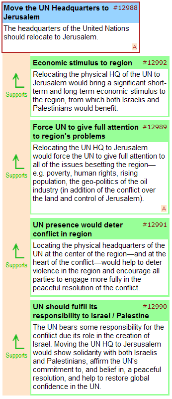
The visual mapping process also opens up the possibility of creative brainstorming and lateral suggestions, such as the proposal to relocate the UN headquarters to Jerusalem, illustrated below – and we would like to see more contributions of this kind as the map develops over the coming weeks.

Given the progress made with the map so far, and the work still ahead, we’re extending the first mapping phase through the spring, and, will be including other partners in the process as we seek to engage the main actors in the region.
Anyone who would like to join us in this process is welcome to do so, and, if you would like to involve your own blog or website readers in the debate, you can embed the map—like a YouTube video—using the embed code shown below:
<iframe src=’http://debategraph.org/flash/fv_indep.aspx?r=11474&d=2&i=1′ frameborder=’0′ width=’490′ height=’650′ scrolling=’no’></iframe>
In the meantime, I will be examining different areas of the map in detail on the blog over the coming weeks and will present the mapping community’s work-in-progress to a conflict resolution forum in Haifa later this year.
Cross Posted at: Independent Minds
Obama: Making Sense of the World?
And so the kaleidoscope turns, and we see the world anew.
Or do we?
Barack Obama’s inauguration today as the 44th President of the United States of America, marks the end of a remarkable personal and national journey. Arrival at such a destination is a cause for global celebration. But as with all great journeys the arrival is also only a beginning.

Obama is taking a leading role in a world system that is severely perturbed on multiple levels. Such perturbation often proceeds collapse: and can proceed the emergence of a more sophisticated and better-adapted system.
It’s not clear—it never is—to what extent the choice of branching paths is open to us. But it surely behoves us to act as if it is.
My (personal) sense is that we face a mess of complex, interrelated and non-linear problems; sane responses to which lie beyond our existing methods and tools. In essence, we need to re-configure our modes of political thinking and organization to enable us—as local, national, and international communities—to move significantly closer to collective maxima of intelligence (both reasoned and emotional).
For those for whom the analogy is familiar, we’re awaiting The Mother of All Demos in the political realm to match Doug Engelbart’s technological masterpiece 40 years ago (which pre-figured much of the technological landscape that we inhabit and take for granted today). It’s the social dimension of Engelbart’s vision of augmented collective intelligence that lags behind our technological achievements: and it needs to catch up quickly.
The signs are that Obama, and the team around him, are mindful of this. As others have noted already, one of the most encouraging aspect of the Change.gov experiment was the speed at which the interaction on the site improved iteratively across the transition. The challenge now is how to crystallize this process—to enable genuine and deeply collaborative sensemaking—and how to set this process in motion in the first few months of the administration when the opportunity and receptivity to change are greatest—and when the character of the administration will be forged.
Readers of The Independent and others who have joined in developing the Obama and Gaza maps over the last couple of months have demonstrated on a smaller scale and in vitro that different and radically collaborative models of sensemaking are possible—and we are grateful to everyone who has participated directly so far, blogged about and embedded the maps, and to the BBC World Service’s Digital Planet, BBC Technology and PRI’s The World: Technology podcast for their support in spreading the maps more widely.
Both maps will continue to develop as exploratory exemplars of the kinds of cumulative, comprehensive and distillative sensemaking processes that the web is starting to enable—with the Obama map, in particular, shifting to a focus on the first 100 days.
Deeper challenges remain. The emerging set of collaborative sensemaking and deliberation tools of which Debategraph, is one example, are still nascent, still figuring out the basic principles—still more VisiCalc than Excel. The tools require a basic visual literacy that itself is only just beginning to emerge in society. And the maps, and other sensemaking constructs, require time to build and time for reflection in an impatient and attention-poor age.
But, today, of all days, is a day for optimism. The day on which Barack Obama embodies the realization that long journeys towards distant mountain tops can reach the summit.
Cross-Posted at: Independent Minds

