Mapping the Prime Minister’s Media Debate
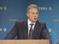
On 12 June 2007, just before he stepped down as UK Prime Minister, Tony Blair delivered a lecture about the state of the relationship between politics and the media.

The Debatemapper team was invited by the Prime Minister’s Office to model the PM’s argument and the ensuing debate; with the structure and content of the debate map fully editable online by the lecture delegates and an invited group of e-democracy experts.
To the best of our knowledge(*), this is the first time in world politics that a live web-based, collaboratively editable debate map has been used in this way. And is further testimony to the pioneering spirit of the Downing Street digital communications team (notably Jimmy Leach, Neil Franklin and, formerly, Ben Wegg-Prosser).
During the mapping project we analysed the arguments presented in 102 media articles – ranging from Fox News to Media Lens – and included arguments advanced by, among others, Andrew Gilligan, Alastair Campbell, Paul Staines and Michael White.
As the Prime Minister anticipated in his speech, the dominant theme of the immediate commentary might be characterised as “look who’s talking”. Indeed, for a substantial proportion of the articles this was the only line of argument developed.
Strikingly, even the articles that engaged with the substance of the argument did so via relatively shallow and narrow reasoning; an observation on the quantity and diversity of the arguments offered in the individual articles (constrained, no doubt, by time and word count) rather than the quality of the arguments or, indeed, the arguer.
To a casual reader, it would be easy to view this surface impression as indicative of the systematic dysfunction identified in the speech. However, the surface impression is misleading in this case.
Although most of the articles made a small number of points, and a few points appeared in most of the articles, the complete set of arguments expressed across all the articles constituted a mature and reasoned response to the Prime Minister’s lecture and developed the debate significantly beyond the case he outlined.
The challenge in perceiving the underlying richness of the response is that the arguments are distributed thinly across the articles rather than concentrated in a few.
Debate mapping addresses this problem by collecting and organising the arguments into a single coherent structure, articulating each argument fairly and concisely, and filtering out the noise arising from repetition, rhetoric and digression.
In this way, editable online debate maps offer readers a comprehensive and highly distilled perspective on the arguments raised in a complex debate and a means to contribute directly to the structure of that debate; the trade-off is the structural discipline and learning-curve involved in building and exploring the maps, which will not be to everyone’s tastes.
The lecture debate map (which you can access via the “View live in context” button in the short debate strand below) helps us to see both how the collective media response expanded the debate beyond the argument outlined by the Prime Minister and, perhaps more significantly, how the analysis, both in the Prime Minister’s speech and in the media response, was heavily weighted towards the diagnosis of the perceived problem as opposed to its resolution.
While some commentators disputed the degree of the dysfunction in the relationship between politics and the media, and others emphasised a proper role for scepticism in the relationship, almost all acknowledged the existence of a troubling dysfunction.
Such systemic phenomena are difficult to break. So it has been encouraging in the last few weeks to see signs of willingness on both sides to explore potential ways forward.
It would be interesting too, reflecting on the observations above, to examine more thoroughly the extent to which the perception of a dysfunctional relationship between politics and the media is skewed by an eye-catching but misleading surface impression that obscures a richer and more mature relationship below. To the extent that this is the case, the foundation for change may be stronger than it first appears.
The current debate map was conceived as a time-limited experiment linked to the lecture, and ending with the Tony Blair’s departure from office on 27 June. The map is far from exhaustive, capturing only the arguments raised during this period, and, like a wiki, remains inherently provisional and open to further refinement. For anyone minded to use the map in such a way, it may well contain the seeds for a mediated solution to the underlying problem.
In the meantime, a huge thank you to everyone who helped us with the project and gave us detailed feedback; the fruits of which are embodied in the latest release of Debatemapper, of which more later.
*If you know of any other examples, earlier or not, we would love to hear about them.
Blogging about Debatemapper
We spend much of our lives debating with each other—and living in the consequences of those debates. But how often do we do it well?
Can we improve the quality of our public and private deliberation?
And, if so, what difference would that make?
That’s the starting point for Debatemapper.
Let’s see where it takes us.

