Dissecting the G-20 Communiqué
So what are we to make of the G20 Communiqué?
As part of The Independent’s visual mapping of the London Summit, we have broken down the G20 communiqué into an interactive visual graph, that lets you comment on and rate each of the major points.
…and we want to know what you think about the measures proposed.
So, start exploring the interactive graph below—by clicking on the spheres—and log-in to tell us if you’re feeling quantitatively eased or squeezed.
And why?
Visualizing Middle East Peace
The events in Israel and Gaza this year have prompted gloomy prognoses for the prospects for peace; a mood deepened by the mixed signals from the Israeli election and the latest developments with Iran.
Lord Patten, writing for European Voice last month, struck a particularly bleak note:
"However tough things looked in the past, I have never felt such a sense of despair about Palestine and Israel. Reason has been drowned in blood. It seems as though the politics of hope have given way to the politics of the cemetery. Poor Palestine. Poor Israel."
Independent readers and the Debategraph community have started to explore the options for peace in the Middle East over the last few weeks, and, though the map is still at an early stage of development, it already provides a succinct insight into the nature and scale of the challenge; showing how strong views at either end of the spectrum pull the peace proposals towards the gyre of despair.
One of the advantages of visual mapping in this context, though, at least at the outset, is that it’s not asking anyone to take sides: just asking everyone to pool their understanding to map the contours of the problem.
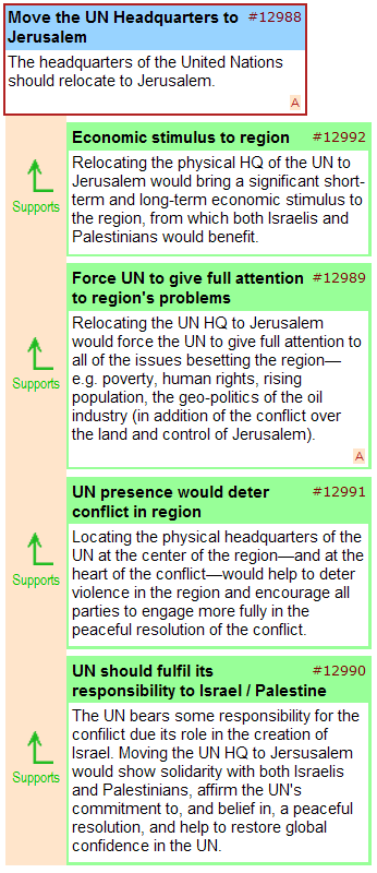
The visual mapping process also opens up the possibility of creative brainstorming and lateral suggestions, such as the proposal to relocate the UN headquarters to Jerusalem, illustrated below – and we would like to see more contributions of this kind as the map develops over the coming weeks.

Given the progress made with the map so far, and the work still ahead, we’re extending the first mapping phase through the spring, and, will be including other partners in the process as we seek to engage the main actors in the region.
Anyone who would like to join us in this process is welcome to do so, and, if you would like to involve your own blog or website readers in the debate, you can embed the map—like a YouTube video—using the embed code shown below:
<iframe src=’http://debategraph.org/flash/fv_indep.aspx?r=11474&d=2&i=1′ frameborder=’0′ width=’490′ height=’650′ scrolling=’no’></iframe>
In the meantime, I will be examining different areas of the map in detail on the blog over the coming weeks and will present the mapping community’s work-in-progress to a conflict resolution forum in Haifa later this year.
Cross Posted at: Independent Minds

